

 HANDS ON SharePoint
 HANDS ON Teams
 HANDS ON Lists
 HANDS ON tek
 M365 Admin
Format an image column with preview in Microsoft Lists and SharePoint
Microsoft Lists and SharePoint lists now include a column type dedicated exclusively to images that allows a user to upload an image directly to the form and displays a small thumbnail of the image in the list view.
This was a massive improvement when compared with the classic hyperlink/picture column type and in this article, I will show you how to take the new Image column type to the next using column formatting.

Having to click in a list image to open it in a new tab is quite annoying and will send the user away form the list context. To avoid it, the following code generates a popup with the real image that is shown in the context of the list when the user hovers it.
How to format an image column type
To implement the formatting in any Image column type you must to do the following:
- Click in the arrow next to the column name
- Expand the column settings and click in the format this column
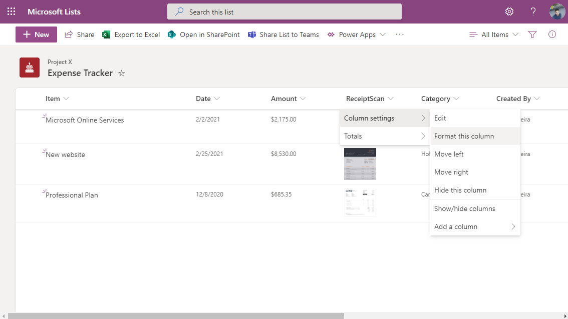
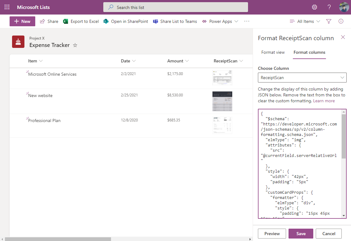
- In the format column pane paste the JSON code below
{ "$schema": "https://developer.microsoft.com/json-schemas/sp/v2/column-formatting.schema.json", "elmType": "img", "attributes": { "src": "=getThumbnailImage(@currentField, 64, 64)" }, "style": { "width": "42px", "padding": "5px" }, "customCardProps": { "formatter": { "elmType": "div", "style": { "padding": "15px 45px 15px 15px" }, "children": [ { "elmType": "img", "attributes": { "src": "=getThumbnailImage(@currentField, 500, 500)" }, "style": { "width": "600px", "padding": "5px" } } ] }, "openOnEvent": "hover", "directionalHint": "rightCenter", "isBeakVisible": true, "beakStyle": { "backgroundColor": "white" } } } - Click save
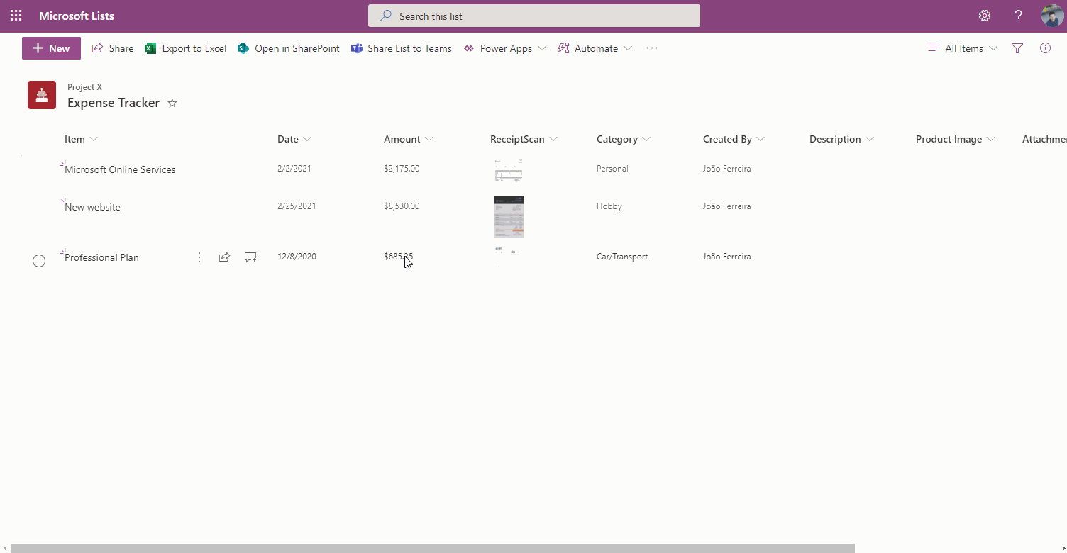
To test your new formatting all you have to do is hover the image in the list as shown in the following animation.
Adjustments to the JSON format
Column formatting is a combination of JSON and HTML that creates custom HTML structures to render the values in columns, this particular example has 2 images and makes use of the custom card property.
The first image is used to display the thumbnail in the column itself and has a width of 42px, while the second image is used to display the preview inside the card and has a width of 600px.
The following list of properties is formatting the card that is configured to be displayed on hover, on the right side and with a beak visible; in the following list you have the cart properties and next to the name of the property you have all the options you can use to format your card.
- “openOnEvent”: “hover | click”
- “directionalHint”: “topCenter | bottomCenter | leftCenter | rightCenter”
- “isBeakVisible”: true | false
Adjust it to your own needs and enjoy the formatting for the modern image column type.


January 25, 2021
Thanks for sharing!! Keep going!
December 21, 2023
Best example found on the internet, thank you
January 16, 2024
I tried using this code, but my image disappears from the column.
January 26, 2024
Hi Michelle,
The location where images are stored changes on Microsoft Lists, I just updated the code to support both the new and old location.
Give it a try and let me know if it works for you with the new code.
Have a nice day 🙂
January 17, 2024
This is a great feature! Thank you for sharing code to do this.
January 17, 2024
Due to the specification changes, it does not work well when adding new items.
January 26, 2024
Hi MK,
I just updated the sample to make it work with the new image specification.
This new version will support both the old and new spec.
Hope it helps.
Have a nice day 🙂
January 31, 2024
Maybe connected, but I’ve been trying to populate a list with image columns using Flow, the Flow saves the image into the ‘Site Assets/Lists/ document library and references it from the item in my list. So far so good
In a normal list view it works ok, but in Gallery view or using this column view of yours here it cant find the image file
Looking at the line ..
“src”: “=getThumbnailImage(@currentField, 500, 500)”
It seems that there’s another hidden thumbnail file possible located somewhere that my flow isnt creating. Any ideas where?
February 2, 2024
Hi Andy,
This could be replated with the recent change Microsoft made to the image column in lists, more information about it is available in this post.
Have a nice day 🙂
February 26, 2024
Thank you. I am not a programmer, but still I could use it and it works!
the hover over is now working on ‘All Items’ (list view), but not on gallery view or board view. Can we have the same ‘hover’ action there?
February 26, 2024
Hi Petra,
To make something similar to the gallery view it is necessary to format the entire view instead of just formatting the image column.
The formatting I’m providing in this article only works for the list view, it does not support the gallery and the board views.
Have a nice day 🙂